User Experience, Web Design
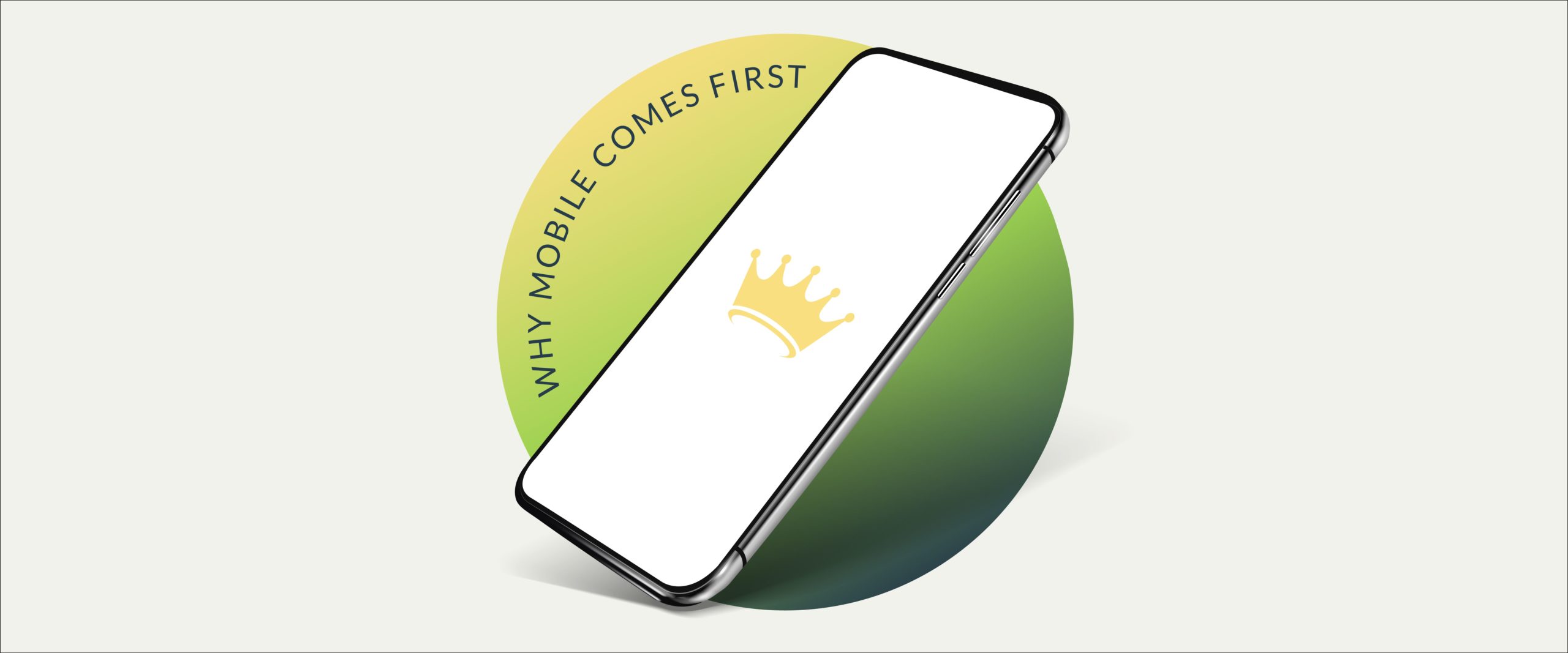
You’re probably reading this blog on your phone.
If you are scrolling through this website on your smartphone, you’re in great company. A mobile-first approach is essential, as mobile users outnumber desktop visitors by a wide margin—whether they’re searching for a full-service legal marketing agency or last night’s game highlights. On average, American adults spend four hours each day on their phones.
It’s no wonder many of us suffer from “phone neck.”
Mobile-first layout and content should drive your law firm’s website. We don’t mean a “Honey, I shrunk the desktop version,” but actually creating layout and content primarily with mobile users in mind.
And guess what? When you design a fantastic mobile-first website, it translates into an equally awesome desktop version. We’re talking stop-them-in-their-tracks stuff that can kick up your traffic and potential lead conversions.
More Time on Mobile Screens
According to Techjury, mobile phones alone generated nearly 55 percent of web traffic in 2020. Mobile users increased by ten percent during that time, and more than half of all videos were viewed on mobile devices.
As Hanna Pittman, Web Designer at Postali, says, “Mobile is where your customers are, so mobile is where you start.”
Hanna recommends a compelling yet streamlined mobile layout, then expanding that into a more detailed desktop version.
“Instead of trying to shrink down the desktop – cramming wide-screen layout and content into a single column – your desktop site should be an enlarged version of your mobile design,” says Hanna.
Designing for mobile first often leads to better experiences on desktops too, so it’s a win-win.
Potential Cases Are Searching by Phone
According to Forbes:
- Thirty-nine percent of consumers rely on mobile devices for research.
- Sixty-six percent complete their transactions on a phone or other mobile device.
People have a more favorable opinion of mobile-friendly sites. Mobile users are more likely to purchase goods or services on a site that’s friendly to small screens versus websites that are more difficult to navigate on a phone or tablet.
You want to remove as many barriers as possible to attract new cases. A mobile-first approach to your website’s layout and content is a great place to start.
How to Make Content that’s Friendly to Mobile Devices
You have a different website experience on mobile than the desktop version. Each has unique features and characteristics, and creating a mobile-first layout benefits both.
Streamline Your Design and Content
You can stretch your design and content in the wide-open spaces of a desktop device. Horizontal videos, graphics, and text doesn’t translate well to mobile devices. Their screens are narrow, and horizontal space is limited even in landscape orientation.
A web designer familiar with a mobile-first approach to content organization can create an inviting experience for all viewers by making sure that:
- Content is stacked vertically for narrower screens.
- Forms are also vertically aligned, so users don’t have to scroll back and forth.
- Menus on mobile sites are more straightforward, often incorporating a collapse and expand function.
- Faster loading landing page.
- Plenty of bullet points (hey!), whitespace, and easy-to-read typeface
Intuitive Navigation and Layout
Mobile-first designs feature navigation that is more intuitive for users. Even on plus-size mobile devices, space is at a premium.
Some of the more popular navigation patterns for mobile-friendly websites include:
- Side-drawer menu that hides navigation on the left side until the user selects an option. This design is also called a hamburger menu for reasons we can’t fathom since you load a burger from the bottom up.
- Top or bottom tab bar menu, similar to a desktop menu, but with collapsible tabs. Bottom tab bars make it easy for people to use their thumbs.
- Card menu with options literally on virtual cards with physical boundaries. This option makes browsing simple, even for new users.
Makes Content More Concise
It seems that even as our device bandwidth increases, our attention span decreases. Speed always matters in the digital universe, particularly for mobile users. According to Google, over half of mobile device users leave a page that takes more than three seconds to load.
An elegant yet streamlined design with concise content means faster loading pages and a greater probability of your visitors sticking around longer. Short but impactful content makes your site more skimmable and responsive.
For most law firms, concise information includes:
- Practice areas
- Results
- Locations
Mobile-First Enhances Accessibility
Another bonus for mobile-first web design and content: it allows for greater accessibility for impaired users.
“When it comes to accessibility, designing a site mobile-first gives you an edge,” explains Hannah Pittman, Postali’s web designer. “Concise content is easier on users with vision impairments. There are other considerations, like color and alt text, but designing for mobile-first could give you a shorter checklist of accessibility guidelines.”
Why Lawyers Need a Mobile First Approach to Design?
People turn to lawyers to solve a legal problem. They’re in pain or anticipating trouble. It’s only human to want to get help as soon as possible.
An innovative mobile-first approach to design makes it simpler and more accessible for distressed clients to find out who you are and how you can help. Maybe their car was just rear-ended, or their teenage driver got a ticket. Whatever the situation, a well-crafted website with compelling content and simple navigation could improve case conversion and retention.
We Specialize in Legal Marketing
Postali is a full-service law firm marketing agency. Our award-winning websites rank highly in search engines. We help lawyers in multiple aspects of their practice, including call tracking & voice services, full-scale photo & video production, press & media relations, content marketing, SEO, and paid search marketing.